
Making responsive grid with Flexbox and LessJS
Understanding FlexBox can be challenging in the start. But once you start understanding FlexBox it is really awesome. There are some really good resources out there on FlexBox. This one is the best that I found on medium. In this article, I will cover the concepts to create your own configurable Grid framework based on FlexBox.
Motivation behind writing grid system with FlexBox
- To have a minimal and light weight grid system.
- To have a highly configurable grid where I can control breakpoints and gutters.
- To align content easily e.g vertical alignment which is really easy to do with FlexBox.
- To understand FlexBox in more depth by writing about it.
Wrapping
To use FlexBox you have to wrap your children elements with the container having the flex property. By default, the flex flow will be row. That means all the children elements will be placed in one row.
    display: flex;
}
.column {
    margin: 10px 1% 0 1%;
    width:  calc(25% - 2%);
    height: 150px;
    background: #395B50;
}
<div class="grid">
  <div class="column"></div>
  <div class="column"></div>
  <div class="column"></div>
  <div class="column"></div>
  <div class="column"></div>
  <div class="column"></div>
</div>
So every child element has 25% width with the little adjustments of margin left and right. The more columns you add to the grid more smaller they will get. Since every column is being placed in one row.

This can be a good feature if you want non-stacking grid where every column is being accommodated in one row.
That is something we don’t want for a conventional gird. Since every row in the grid is 100% wide. It should accommodate only 4 children elements with 25% width.
.gird {
    display: flex;
    flex-flow: row wrap;
}
.column {
    margin: 10px 1% 0 1%;
    flex-basis: calc(25% - 2%);
    height: 150px;
    background: #395B50;
}
The flex-flow sets the flow direction to row and enables wrapping if width exceeds 100%. The flex-basis property determines the size of the content-box.

After putting some content in columns grid looks like this.

All the columns are setting their height equal to the tallest column in the grid. This is because align-items by default is set to stretch which is stretching every column. Since we don’t want this behavior for our grid. We’ll override this property with flex-start and that will fix the issue.

Grid System
Most of the UI frameworks use 12 columns grid. That means every row will have 12 columns and you can specify helper classes to expand each child in the grid to certain columns on different view-ports.
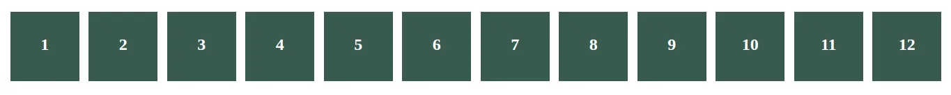
We will create a grid system having 12 columns in each row.
Let’s unleash the power of CSS pre-processor LessJs
To calculate the width of each column I am using this less mixin as a function. This mixin function calculates the flex-size of a column. On a 100% row, you can expand every children element to certain columns. You can also set custom gutters or no gutters later. Less mixin funcitons are really handy when you want to add logic to your CSS.
Sometimes you want to control gutters. Like in common dashboard interfaces with sidebar aligned to the left where you don’t want any gutters between the sidebar column and the content column. Something like this.
For sidebar column I have used mixin .flex-size(3, 0) since it expands to 3 columns with 0% gutters and for content column .flex-size(9, 0).
To expand elements to certain columns in different view-ports I wrote another mixin as a function that uses LessJS variable interpolation.
.viewport-columns(@screen-type: desktop) {
  .@{screen-type}-three {
    .flex-size(3);
  }
  .@{screen-type}-nine {
    .flex-size(9);
  }
 }
With the variable interpolation you can call this mixin on different breakpoints and can have helper classes like desktop-three, tablet-nine or mobile-twelve. With the power of variable interpolation you can have more classes like extra-small-phone-nine with only adding a new breakpoint with .viewport-columns(extra-small-phone).
@media (min-width: 991px) {
  .viewport-columns(desktop);
}
@media (max-width: 991px) {
  .viewport-columns(tablet);
}
@media (max-width: 661px) {
  .viewport-columns(phone);
}
Gutters
For creating custom gutters I have created these helper classes.
.no-gutters {
  [class*='desktop-'], [class*='tablet-'], [class*='phone-'] {
    margin: 0 0 10px 0;
  }
}
.relaxed-gutters {
  [class*='desktop-'], [class*='tablet-'], [class*='phone-'] {
    margin: 0 1% 10px 1%;
  }
}
// that also change the calculation of every column's width
@media (max-width: 661px) {
  .relaxed-gutters {
     .viewport-columns(phone, 2%);
   }
}
Of all the celebrated features of FlexBox these are the ones I like the most.
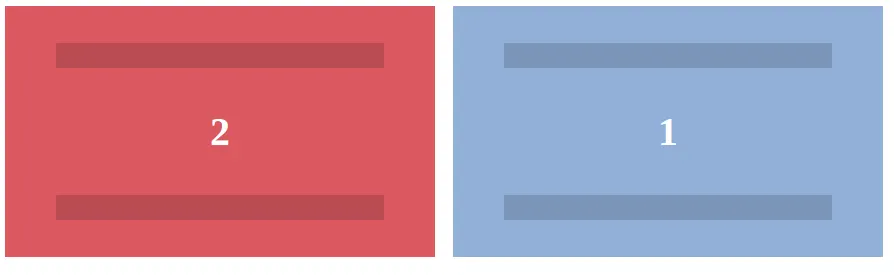
Row Reverse
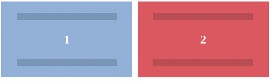
You can reverse the columns in a grid
.grid.reverse {
    flex-flow: row-reverse wrap;
}
.centered {
    justify-content: center;
}
<div class="grid centered reverse">
  <div class="desktop-six tablet-six sky-blue">
    <div class="container">
      <p>1</p>
    </div>
  </div>
  <div class="desktop-six tablet-six orange">
    <div class="container">
      <p>2</p>
    </div>
  </div>
</div>
Vertical Alignment With overriding the property of align-items from flex-start to center you can vertically align every column in the grid. Provided your layout have some defined height it should not be defaulting to height: auto;.
Centered Grid With overriding the property of justify-content, from inherit to center, you can horizontally center your columns in a row. justify-content only has an effect if there's space left over in the row. That means in the grid your elements are not taking whole 12 column space.
Conclusion
I hope this article has given you a perspective to create a simple functional grid system based on FlexBox. With LessJs you can create helper classes easily to have a highly configurable grid system.
Here is the Codepen where you can play with this grid system. Open it in a new tab to see columns expanding on different view-ports.
Subscribe
Honest takes on AI, startups, and digital health—delivered to your inbox.
Your privacy is paramount. Expect content once or twice a month. Unsubscribe anytime if you don't like it.
Get Email Updates